Table of Contents
- What is GutenBricks?
- Creating Card Variations
- Responsive Card Layouts
- Setting Up the Feature Grid
- Connecting the Cards
- Editing the Block
- Visibility Toggles
- Implementing Branding Colors
- Final Touches
- Conclusion
- FAQ
What is GutenBricks?
GutenBricks allows you to create layouts in Bricks and turn them into Gutenberg blocks. This functionality gives your clients the ability to use these blocks without compromising the design integrity.
Using Inner Blocks
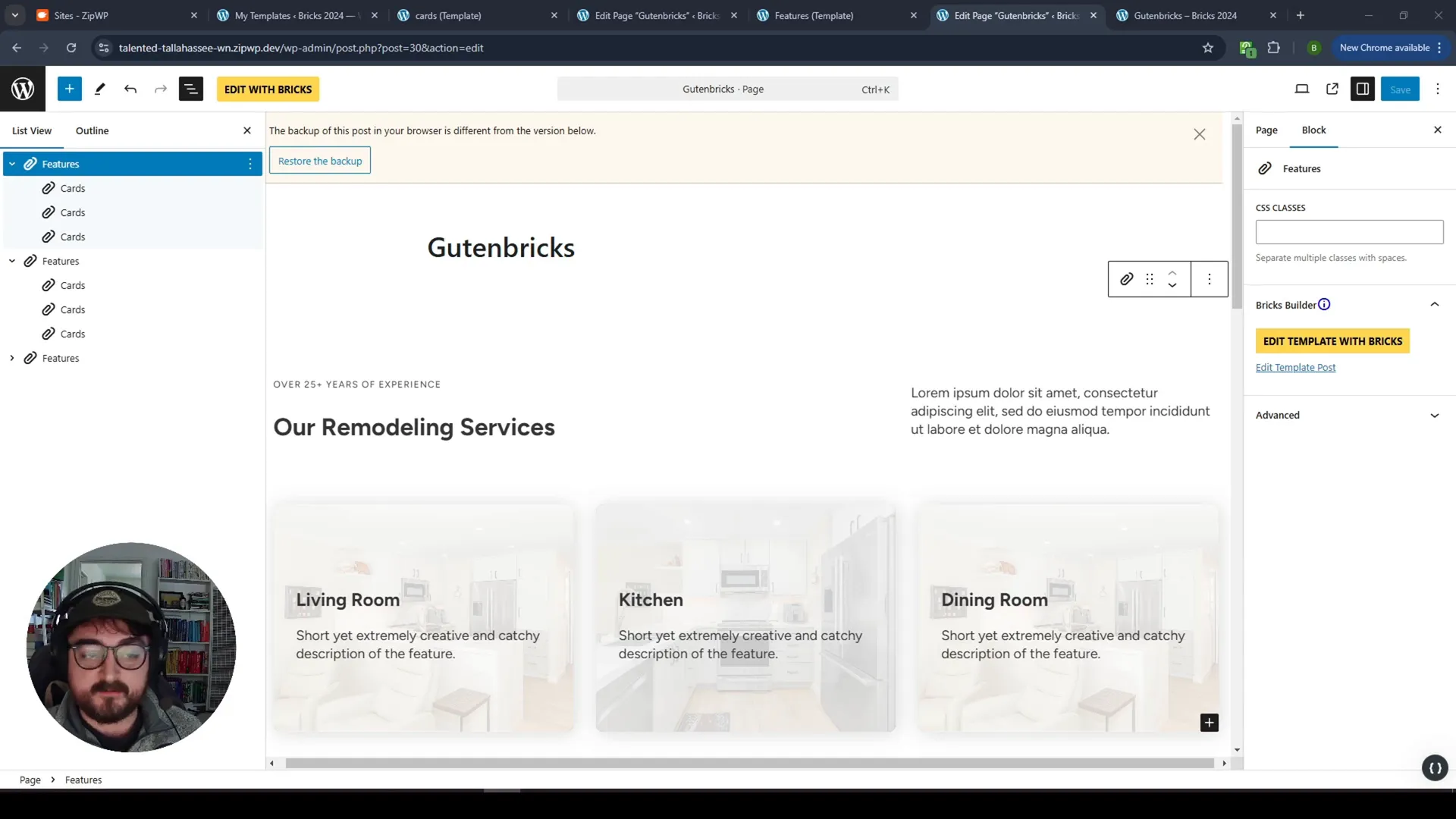
A major feature of GutenBricks is the use of inner blocks. This allows for nested blocks within a custom block, giving you control over your design while providing a user-friendly interface for clients.
Creating Card Variations
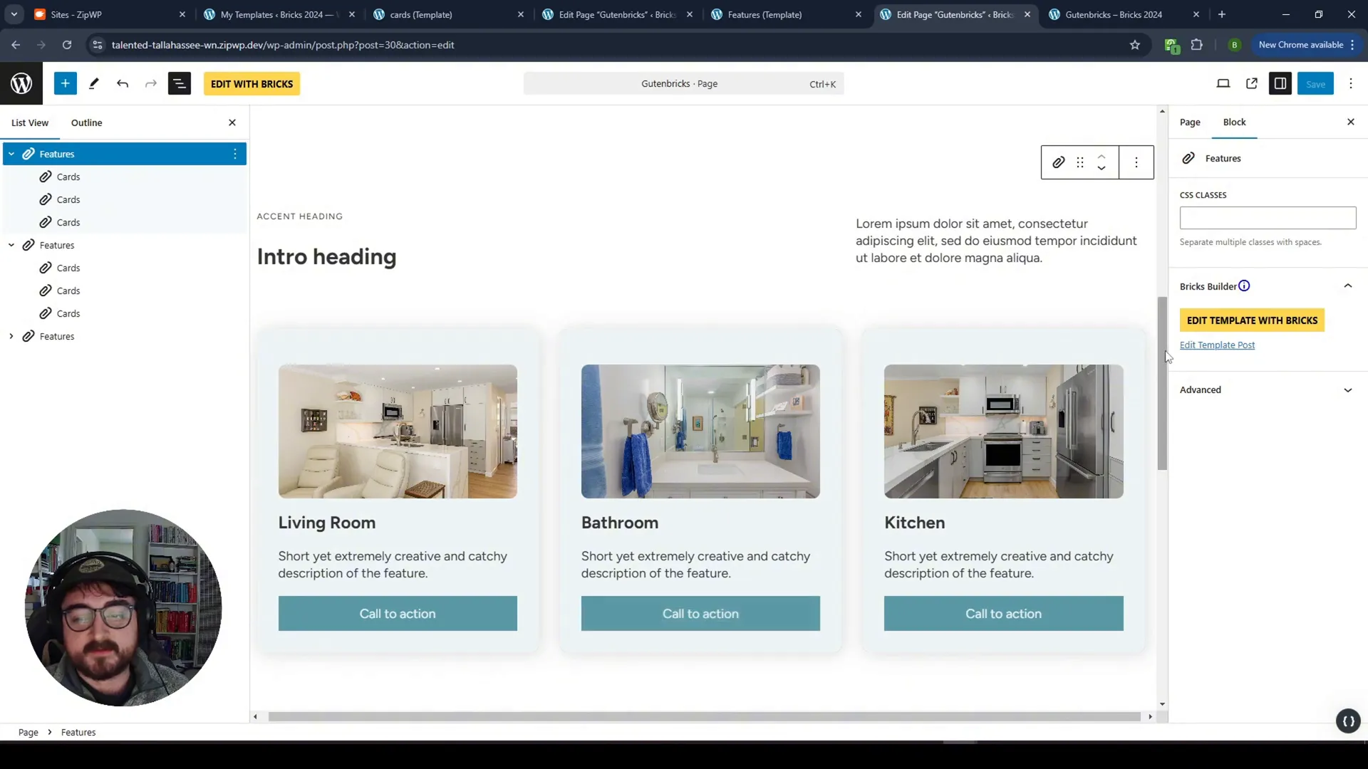
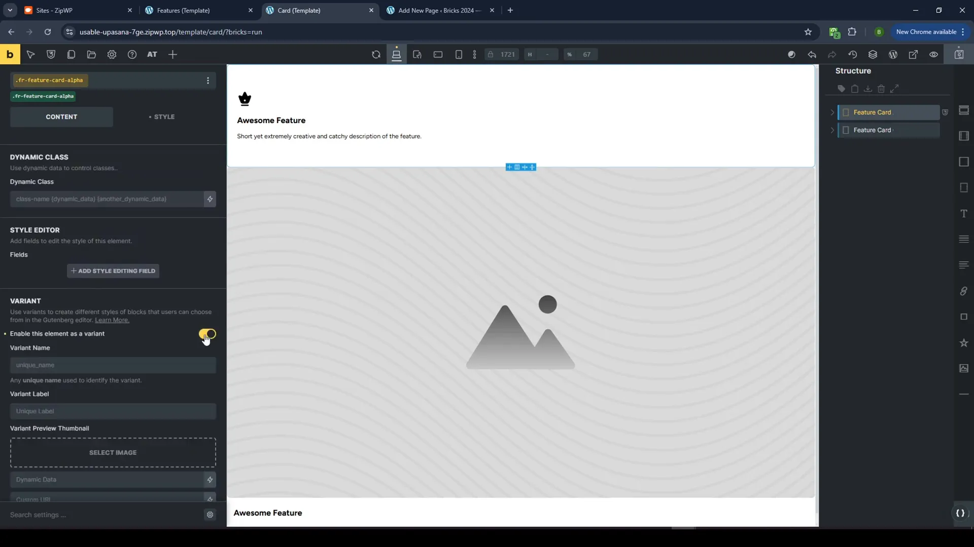
Let’s take a look at how to create card variations. You can have multiple styles for a single card component. For instance, you can have a background image version, a regular image version, and even an icon card style.
Conditional Displays
Using conditional displays, you can hide or show elements based on client selections. This allows for more customization without the risk of breaking the design.
Responsive Card Layouts
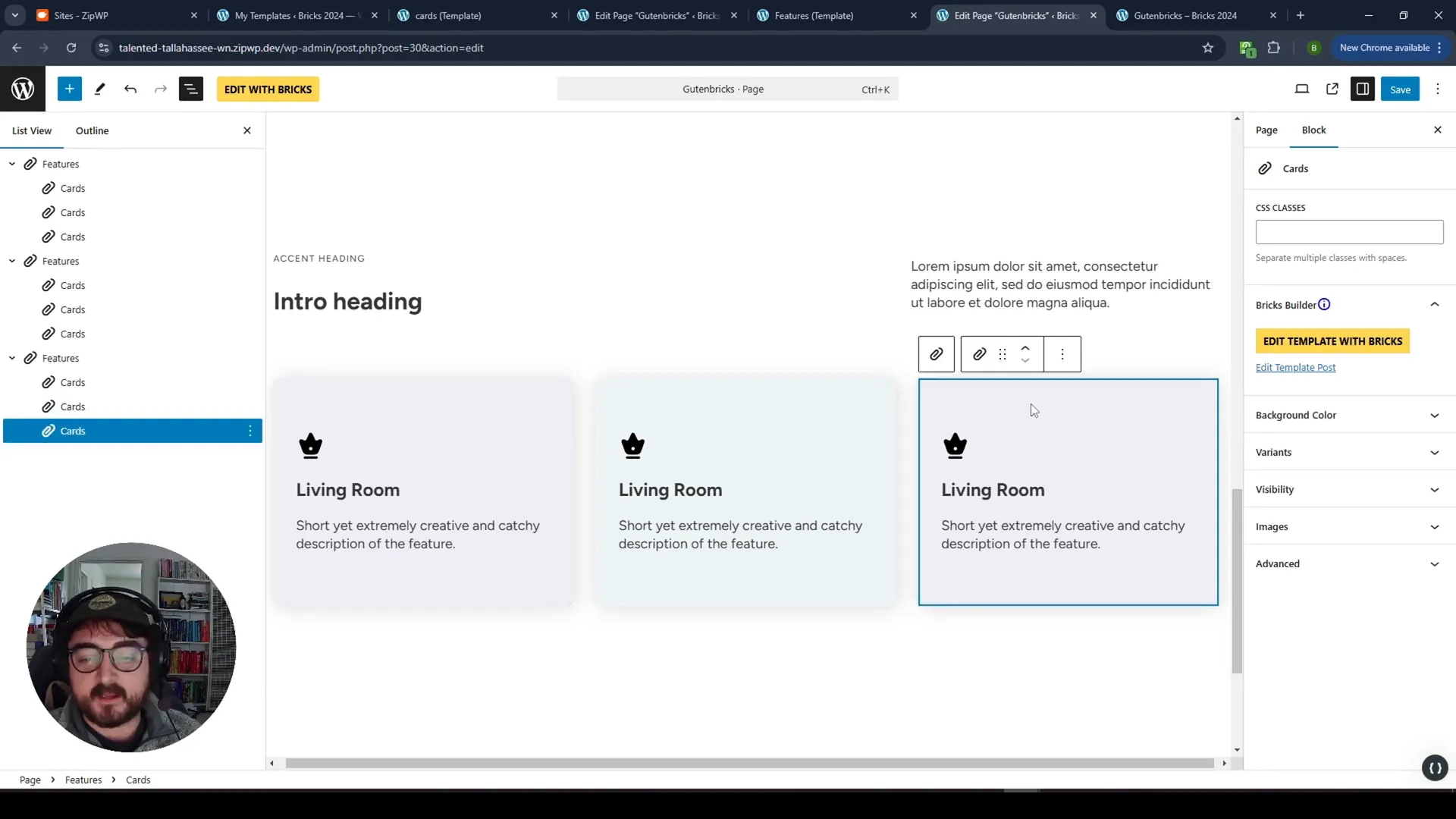
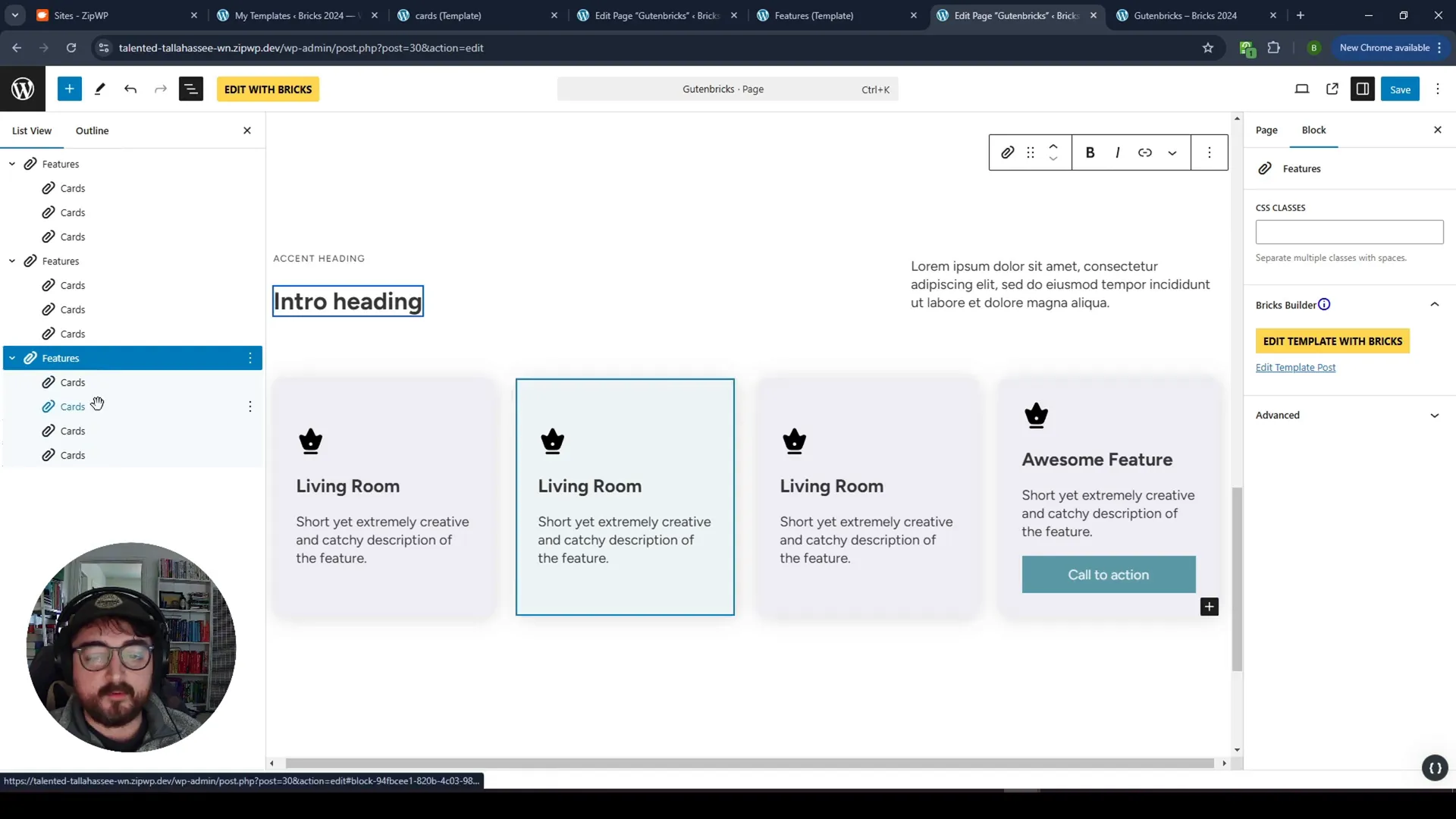
We will use a variable grid system that automatically adjusts based on the number of cards displayed. Whether you have two or more cards, the layout will adapt responsively.
Setting Up the Feature Grid
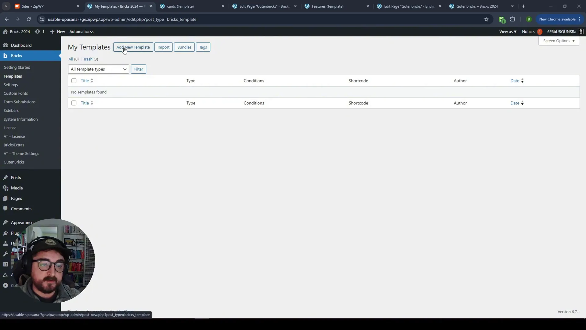
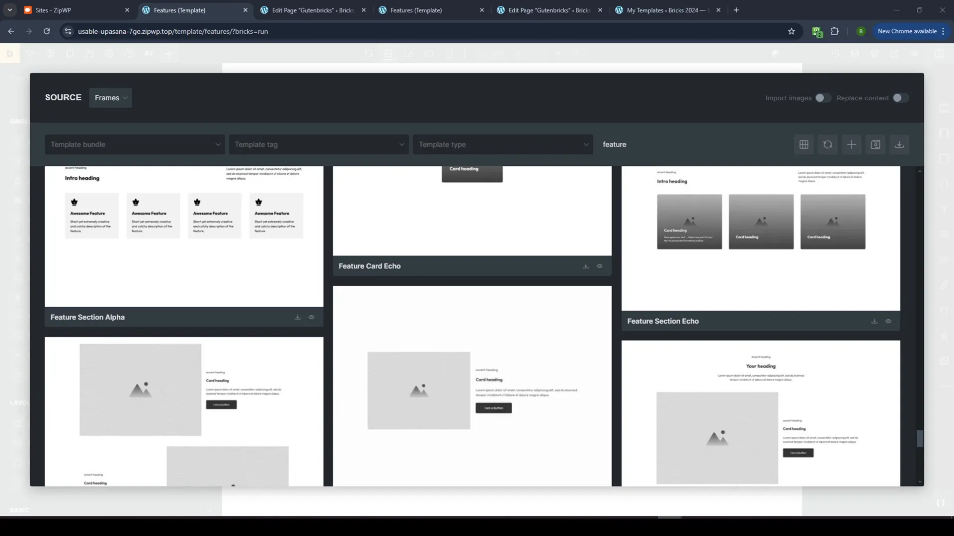
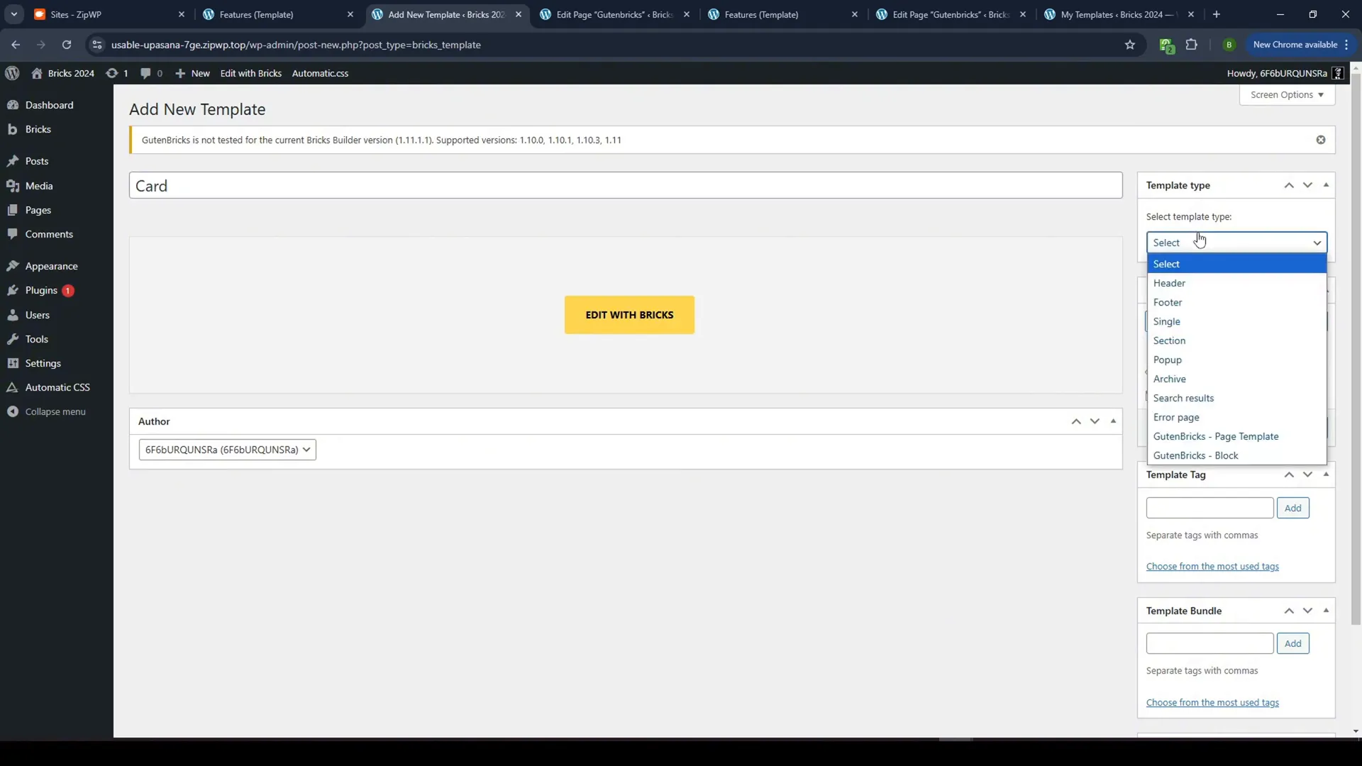
To create the feature grid, start by creating a new template in Bricks. This template will house the inner blocks for the cards.
Using Frames for Quick Setup
Frames can be utilized to insert pre-made grids quickly. By using a basic feature section, you can streamline your workflow.
Connecting the Cards
After setting up the grid, you will add the actual cards to the template. Save these cards as GutenBricks blocks to connect them effectively.
Editing the Block
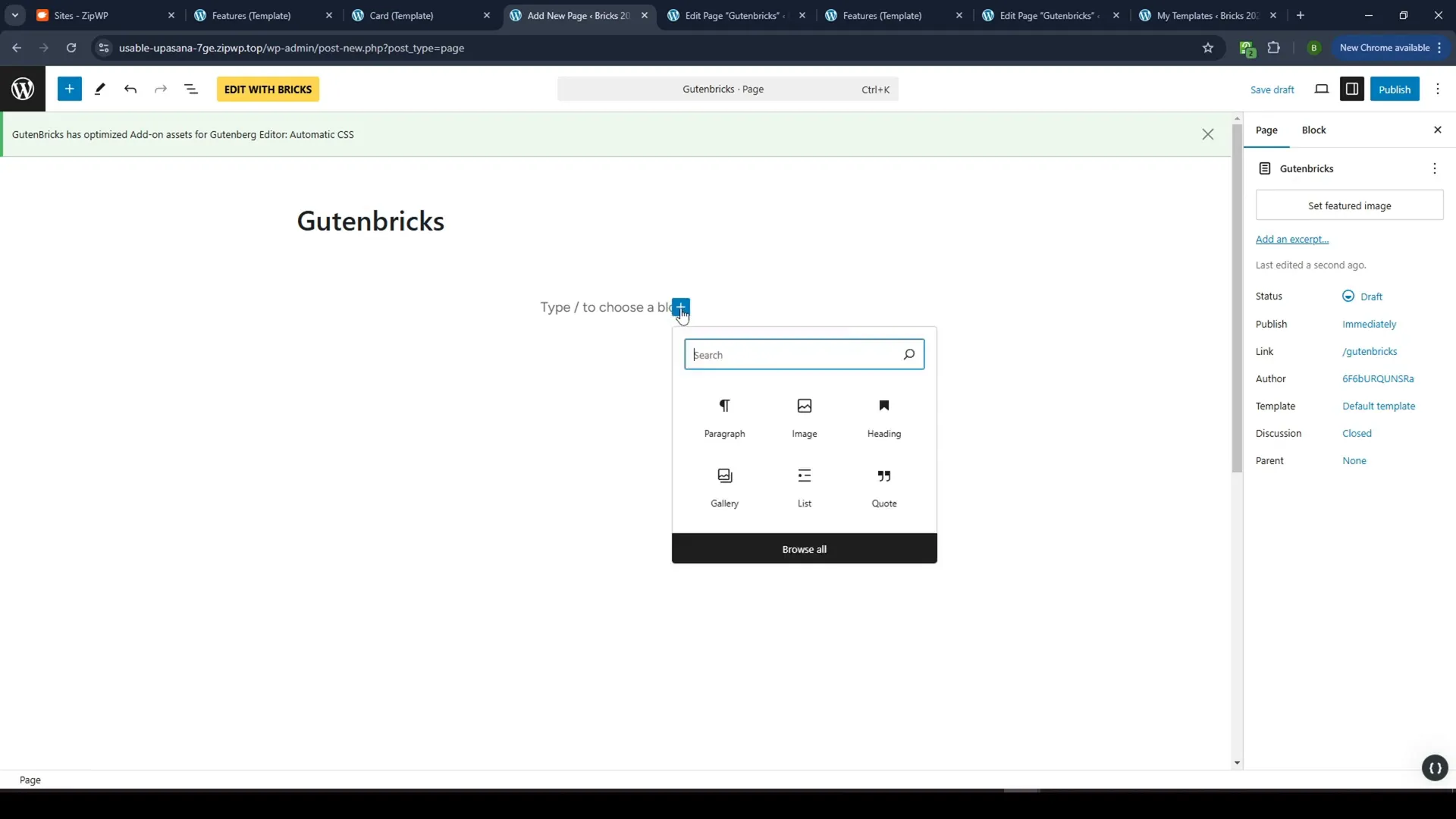
Once the blocks are connected, you can edit the content directly in Gutenberg. This allows full control over the text and images within the cards.
Dynamic Variants
Adding dynamic variants helps you manage different styles for the cards. For example, you can create a variant for each card style, making it easy for clients to switch between them.
Visibility Toggles
Implement visibility toggles to allow clients to show or hide various elements within the card, such as icons or buttons. This adds another layer of customization without complicating the design.
Adding Background Images
To enhance card aesthetics, you can add background images. Adjust the z-index and position settings to ensure your design looks polished.
Implementing Branding Colors
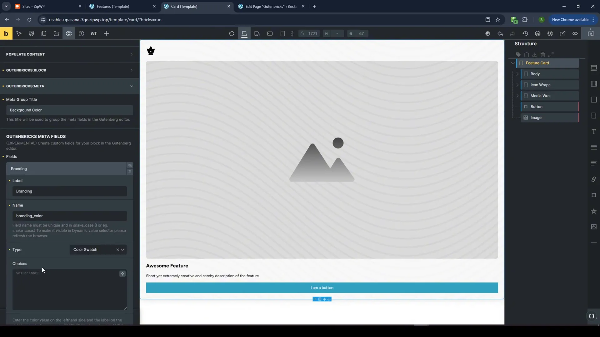
Incorporate branding colors into your cards. By adding a color swatch, you can allow clients to choose colors that align with their brand schema.
Dynamic Backgrounds
Using dynamic values for background colors means that changes to the brand colors will automatically reflect throughout the card system, ensuring consistency.
Final Touches
We’ve achieved a responsive, customizable card system that clients can easily edit without breaking the design. This system uses the power of Bricks, GutenBricks, and ACSS to create a robust web experience.
Conclusion
This tutorial showcased how to create flexible card components in Bricks Builder using GutenBricks and ACSS. By implementing these techniques, you can provide clients with a user-friendly editing experience while maintaining design integrity.
FAQ
What is GutenBricks?
GutenBricks is a tool that allows you to create layouts in Bricks and turn them into Gutenberg blocks, enabling clients to edit without compromising design.
How do I create card variations?
Card variations can be created by using conditional displays and dynamic variants, allowing clients to switch styles easily.
Can I use background images?
Yes, you can add background images to cards and adjust settings such as z-index and position to enhance the design.
How do visibility toggles work?
Visibility toggles allow clients to show or hide elements within the card, offering a customizable experience without altering the overall design.
What are branding colors?
Branding colors are predefined colors that align with a client’s branding, allowing them to maintain consistency across their cards.


