Bricks Builder has recently launched its beta version 1.1.2, which introduces one of the most anticipated features: components. This feature has been highly requested by users and has generated significant buzz in the community. In this post, we’ll take a closer look at what components offer, how they can enhance your workflow, and what additional features might be beneficial.
Table of Contents
- What Are Components?
- Creating Your First Component
- Understanding Properties
- Editing Component Instances
- Limitations and Areas for Improvement
- Conclusion: The Future of Components in Bricks
- Frequently Asked Questions (FAQ)
- Stay Connected
What Are Components?
Components in Bricks are designed to streamline the building process, allowing users to create reusable blocks of content. This means you can design a component once and use it multiple times throughout your site, making updates and changes easier and more efficient.
Getting Started with Components
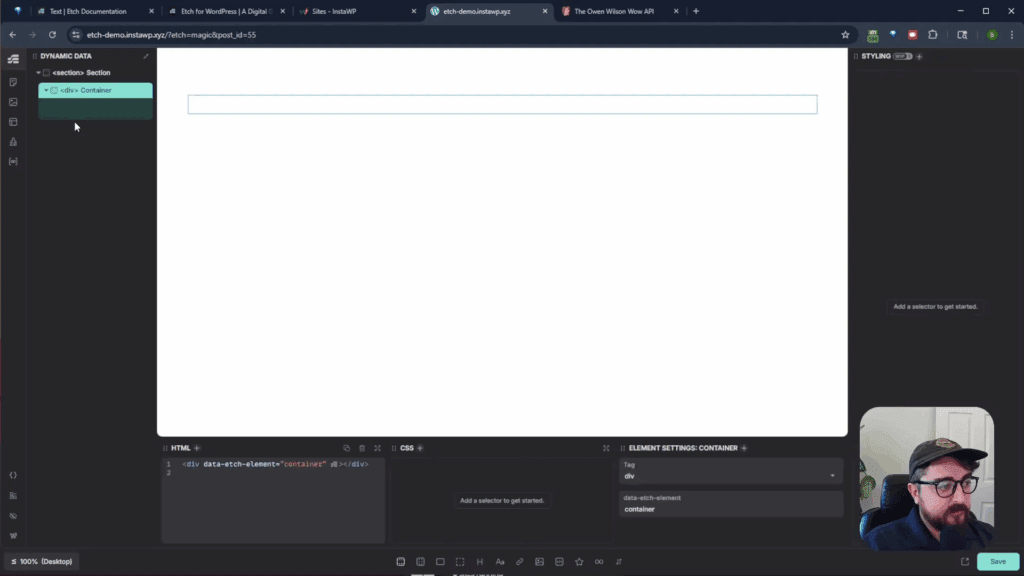
To begin, let’s jump into a site where the beta version is installed. We’ll create a simple homepage and start adding components. First, we’ll set up a demo section for our components.

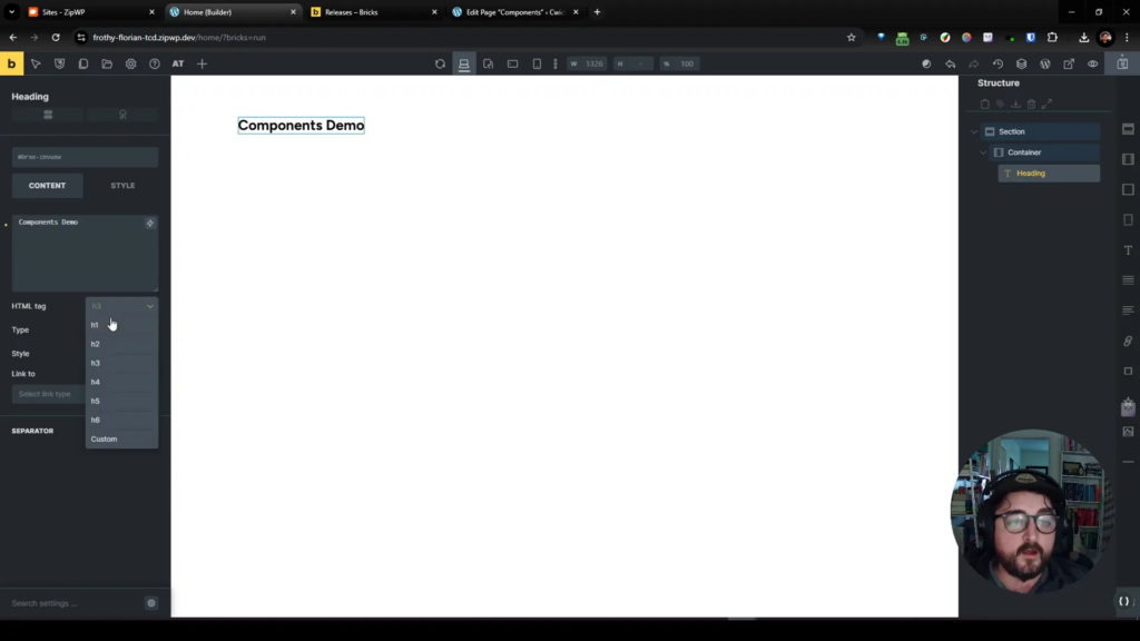
Creating Your First Component
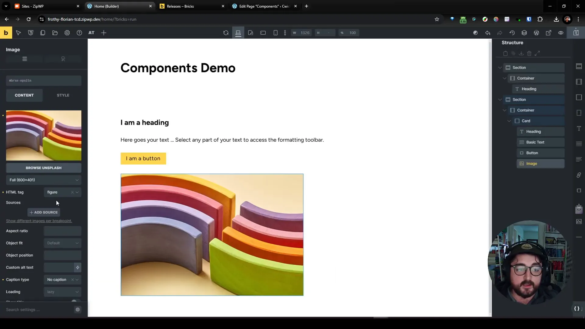
We need to add content to our demo section. Let’s create a card component containing a button, a link, and an image. After setting up these elements, we can convert this block into a component.
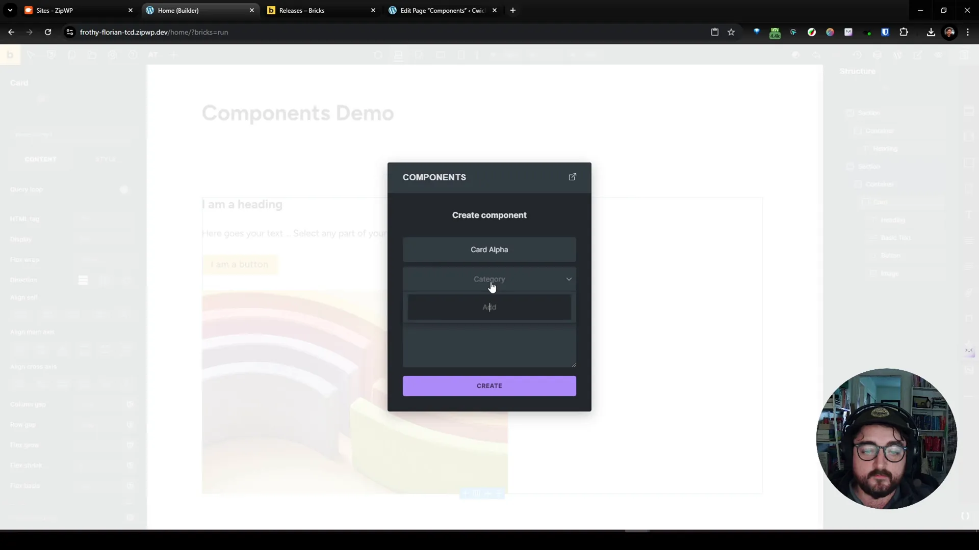
Saving the Component
To save the component, we right-click and select ‘save as component.’ We’ll name it “Card Alpha” and categorize it under “Cards.” This will allow us to manage our components effectively.
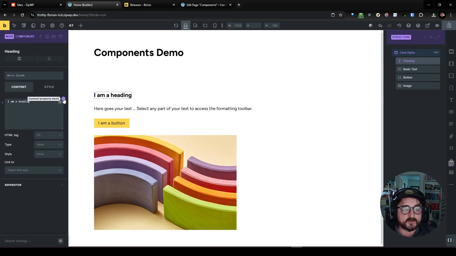
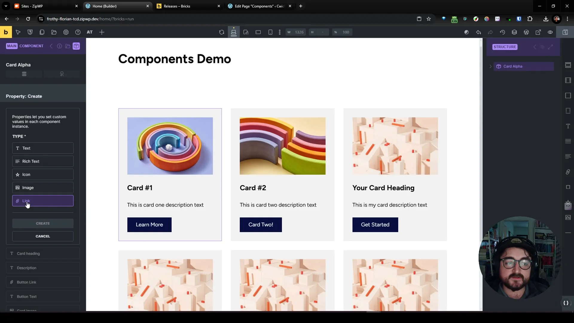
Understanding Properties
Once our component is created, we need to define its properties. Properties determine which elements within the component can be edited later. For our card, we’ll create properties for the heading, description, button link, button text, and image.

Connecting Properties
After defining the properties, we need to connect them to the respective elements in our component. This step is crucial as it allows us to dynamically change the content displayed in each instance of the component.
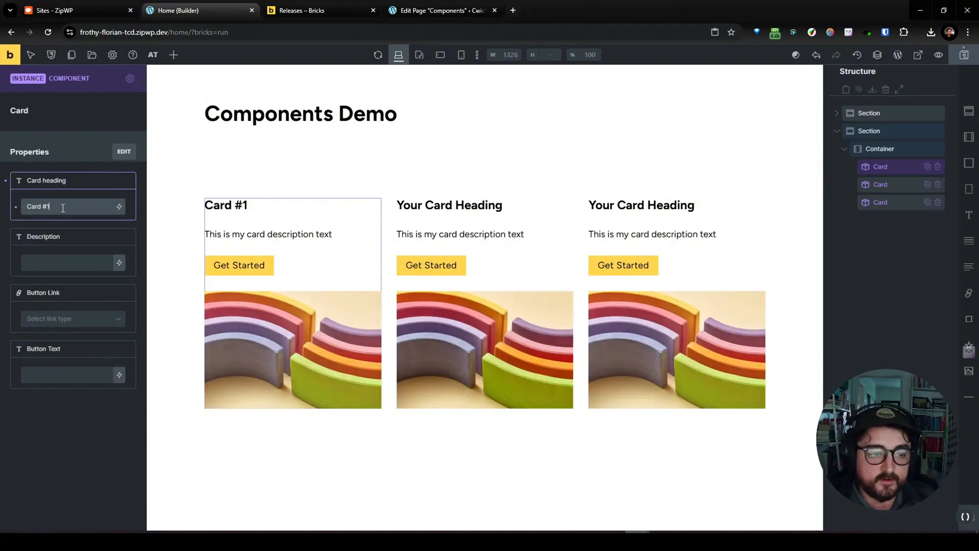
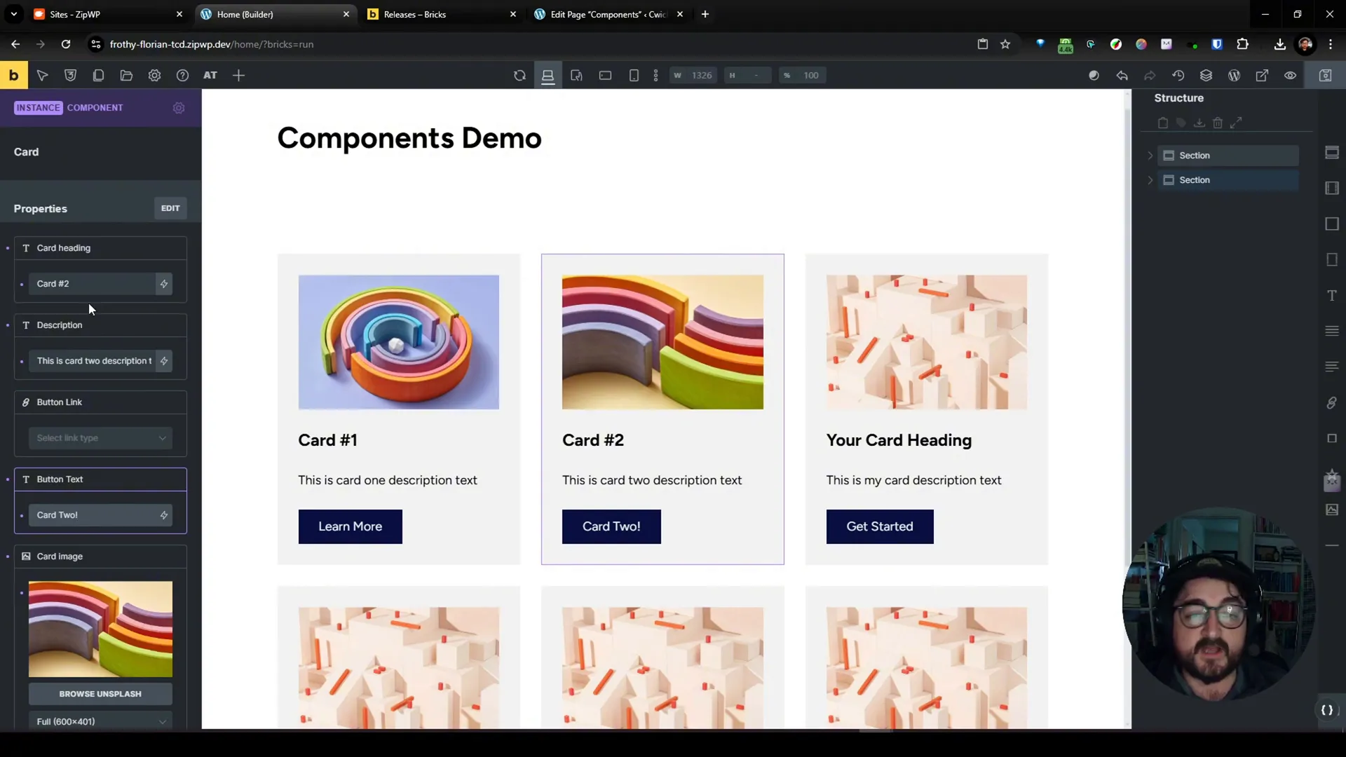
Editing Component Instances
With our component set up, we can now create multiple instances of it. Each instance can have its properties overridden, allowing for unique variations of the same component.
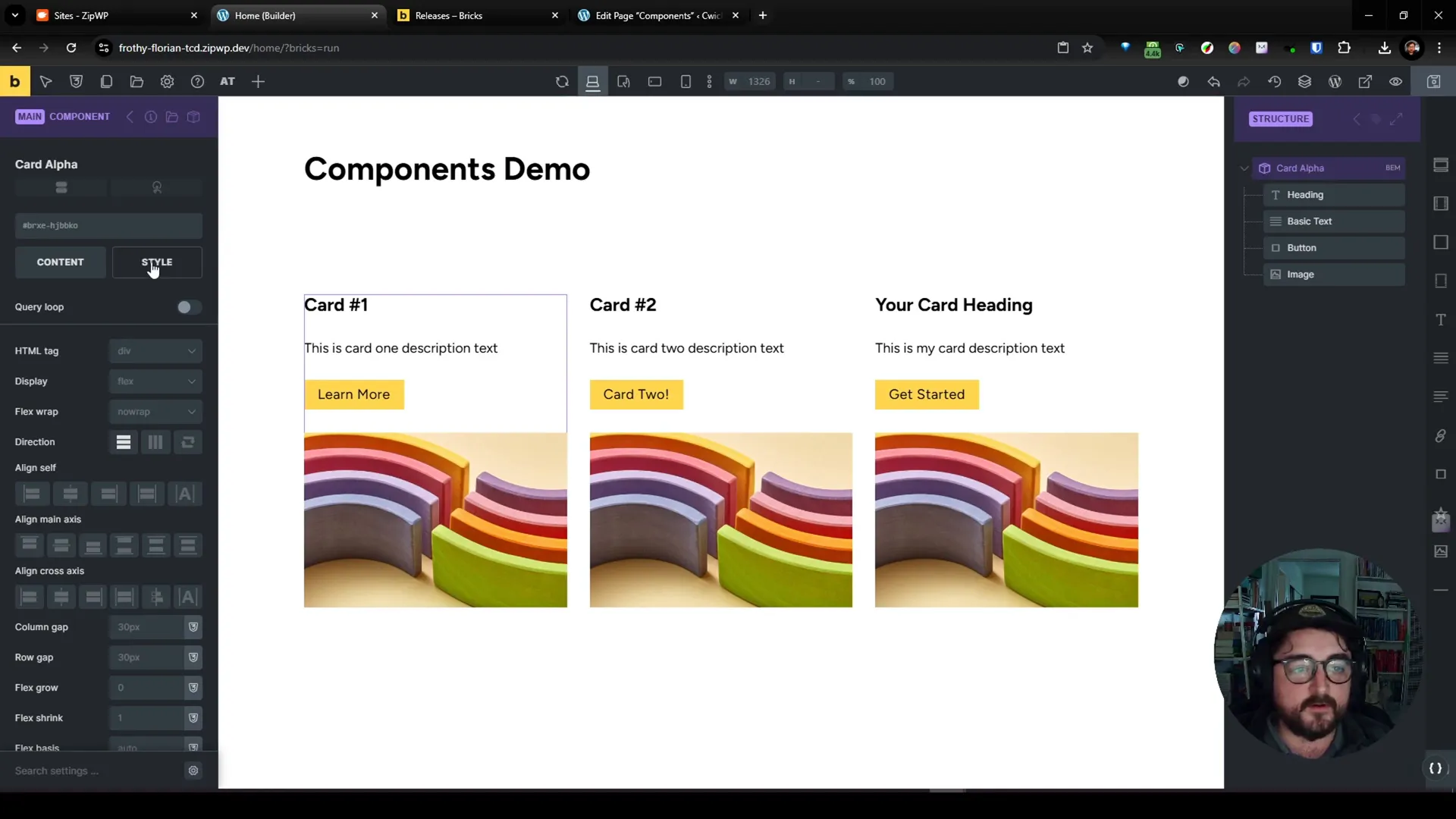
Styling Components
One of the standout features of components is the ability to style them globally. Changes made to the component’s parent will reflect across all instances, saving time and ensuring consistency.
Limitations and Areas for Improvement
While components offer exciting new functionalities, there are areas that could be improved. Currently, components lack certain properties like background color and conditional visibility. These features would allow for greater flexibility and customization.
Comparing to Other Builders
When comparing Bricks to other builders, such as Figma, it’s clear that components could benefit from additional features. Figma allows for style variations and rich property options, which enhance user experience and ease of use.
Conclusion: The Future of Components in Bricks
Overall, the introduction of components in Bricks 1.1.2 is a promising step forward for web designers and developers. While there are limitations, the potential for growth and improvement is significant. As the Bricks team continues to develop this feature, we can expect enhancements that will further streamline the design process.
What do you think about the new components feature? Are there specific functionalities you hope to see in future updates? Let us know in the comments!
Frequently Asked Questions (FAQ)
What are components in Bricks?
Components are reusable blocks of content that can be created and customized, allowing for efficient design and easy updates across a website.
How do I create a component?
To create a component, add your desired elements to a section, right-click, and select ‘save as component.’ Then, define its properties to customize it further.
Can I customize each instance of a component?
Yes, you can override properties for each instance of a component, allowing for unique variations while maintaining the overall design.
What limitations do components currently have?
Currently, components lack certain properties such as background color options and conditional visibility, which could enhance their functionality.
How do Bricks components compare to other builders?
While Bricks components offer basic functionalities, other builders like Figma provide richer property options and style variations that enhance usability.
Stay Connected
For more updates and insights on Bricks and WordPress design, follow me on Twitter or visit my website.
If you’re interested in learning more about web design and development, consider joining my YouTube channel for tutorials and tips.